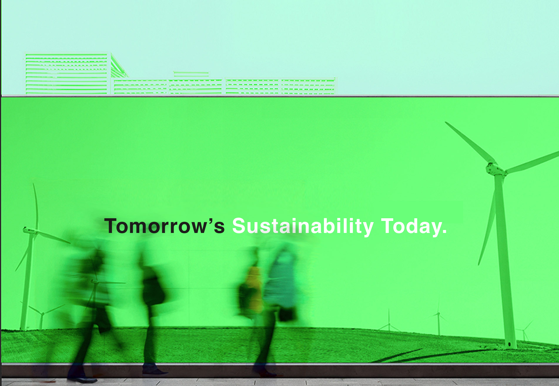
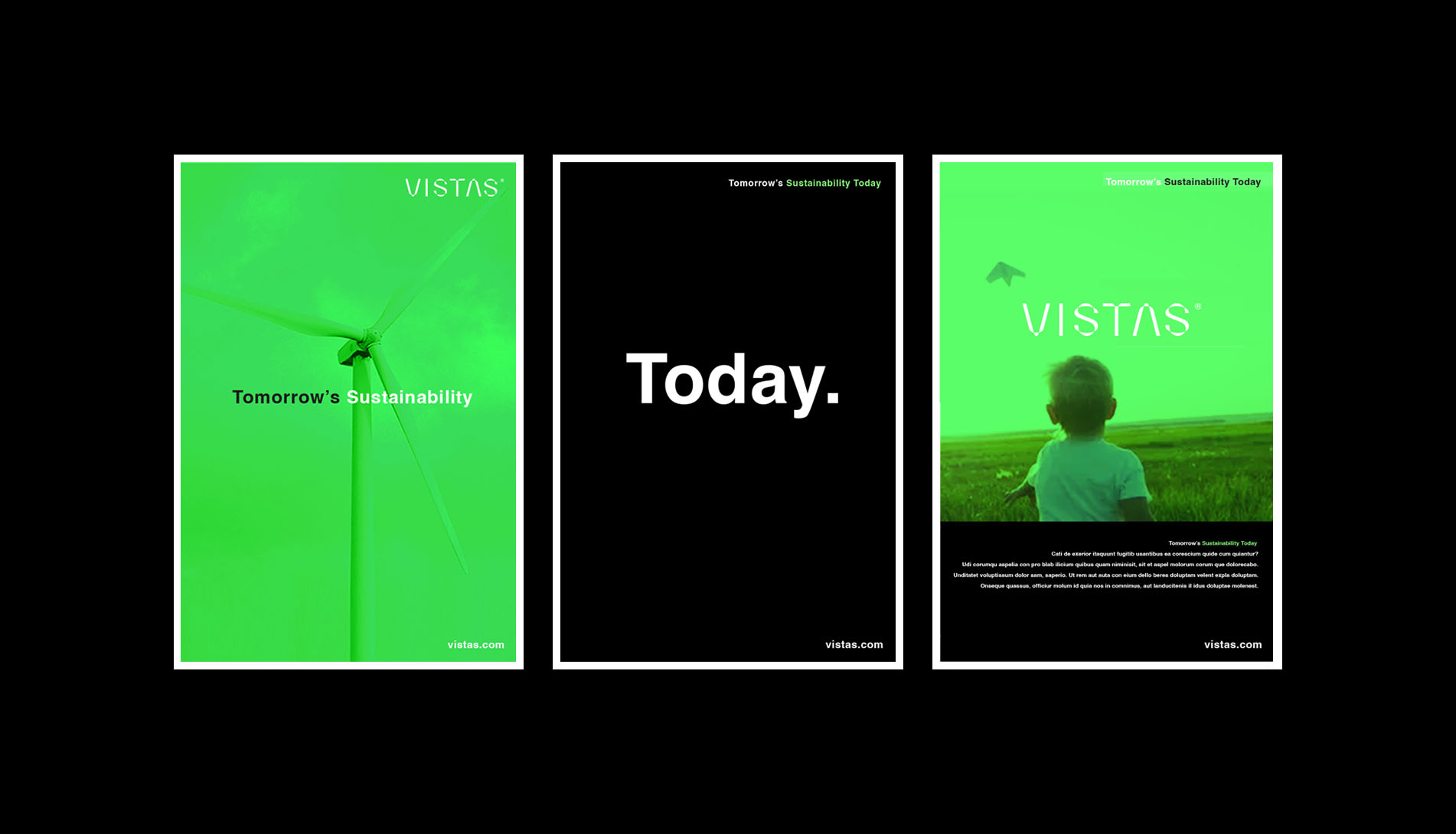
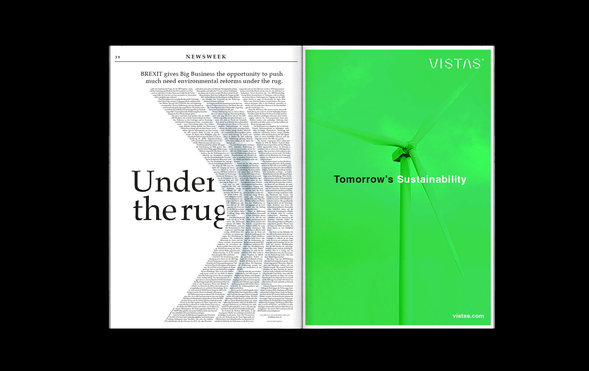
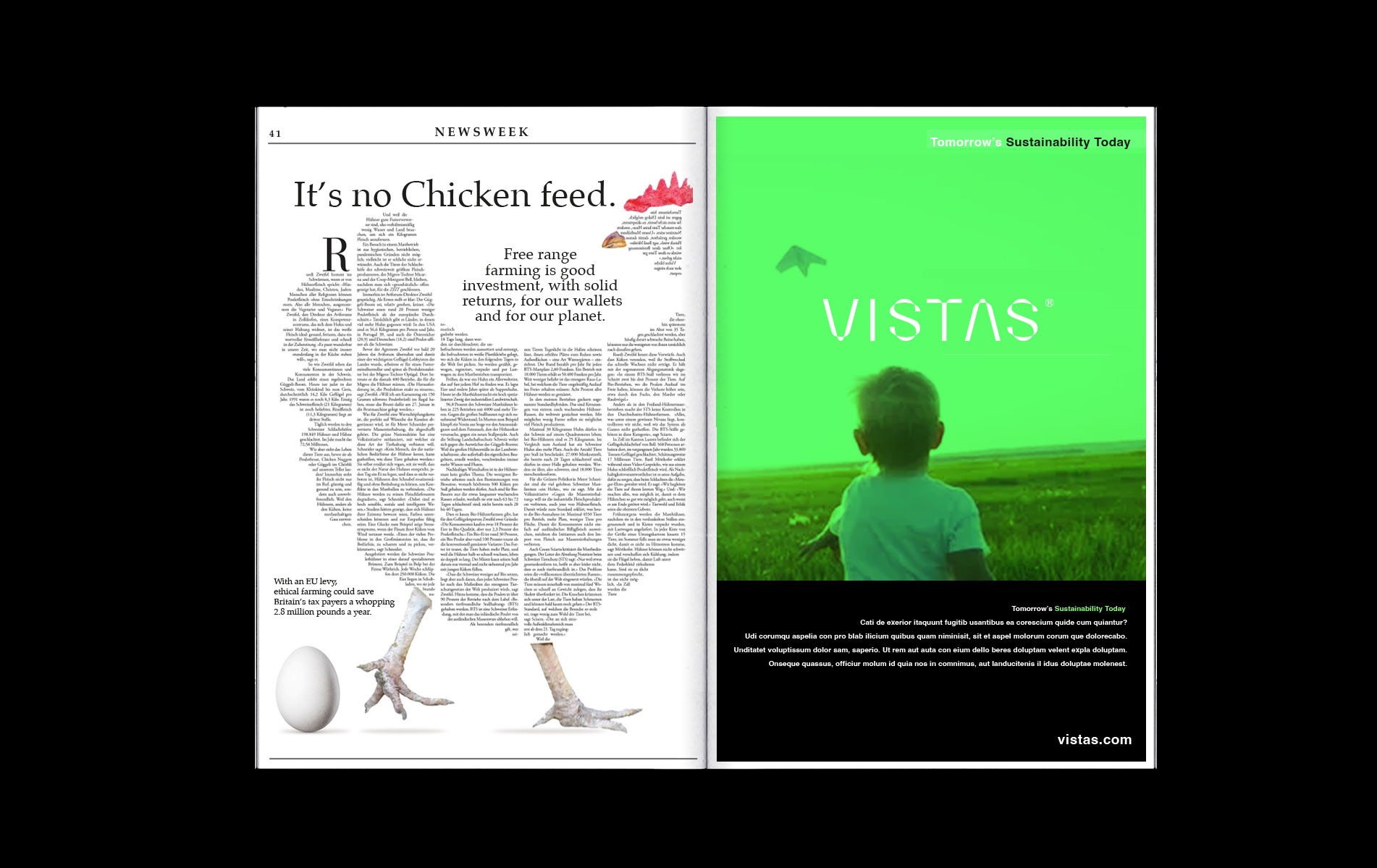
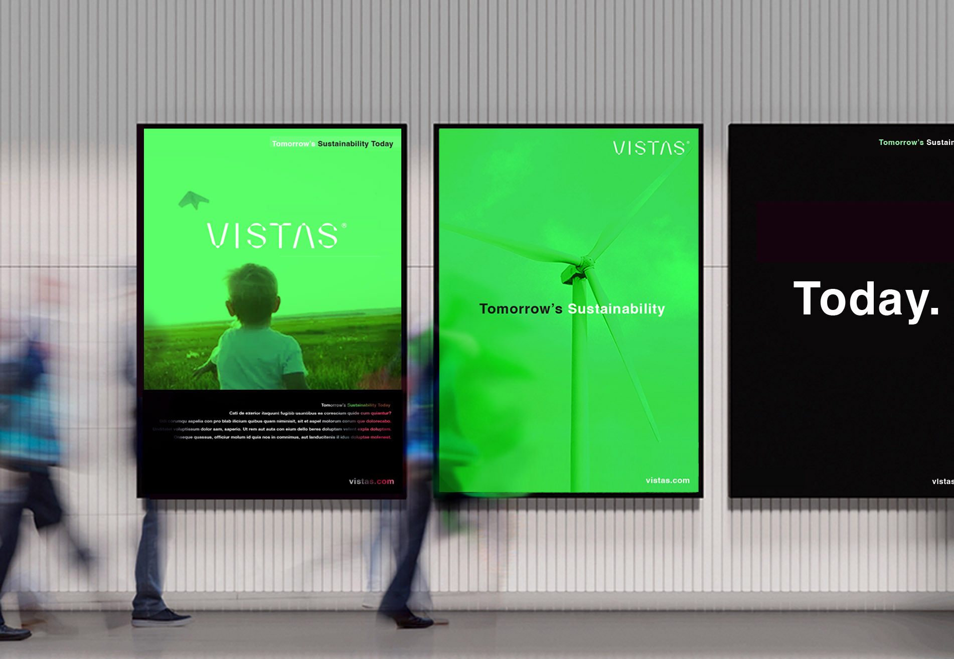
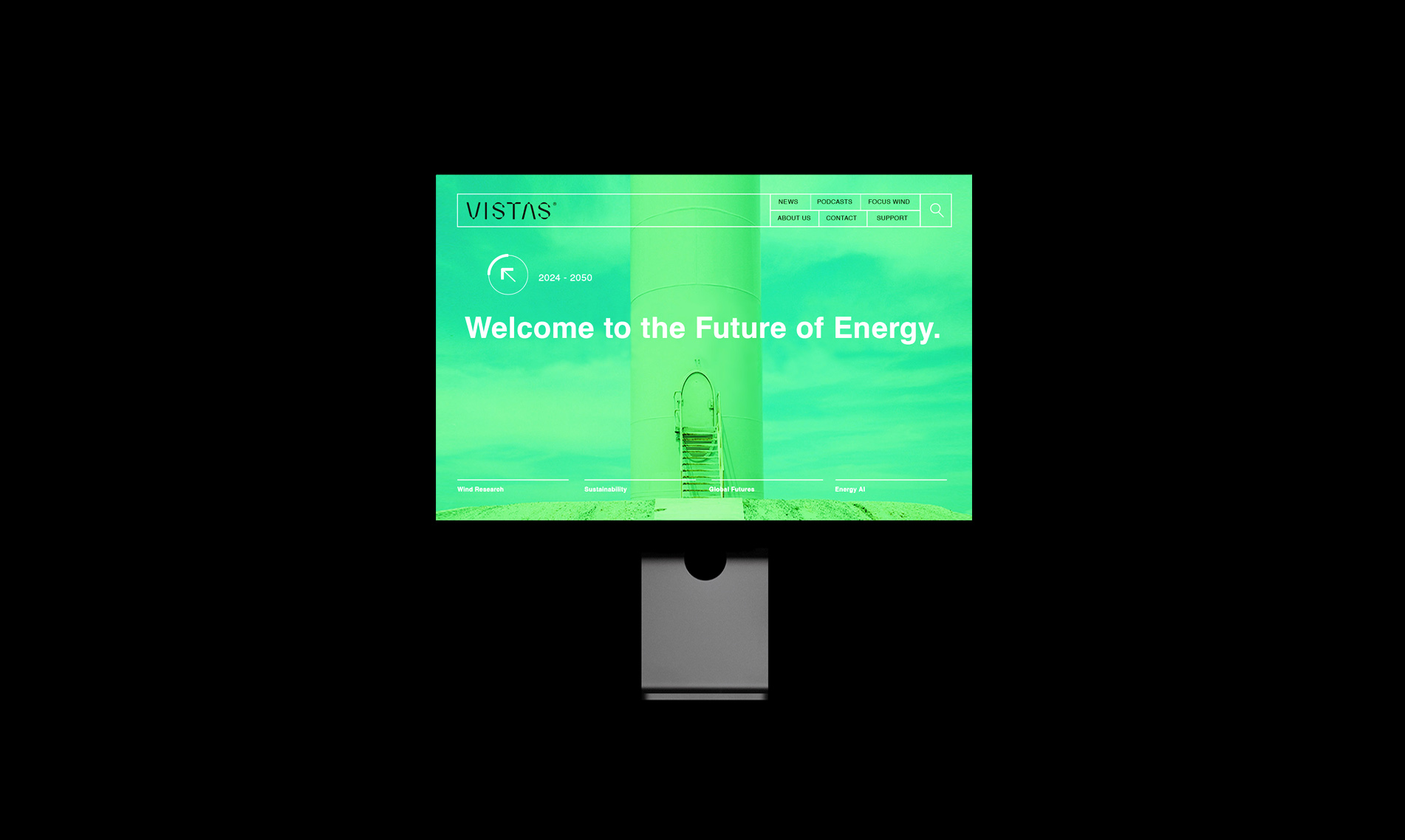
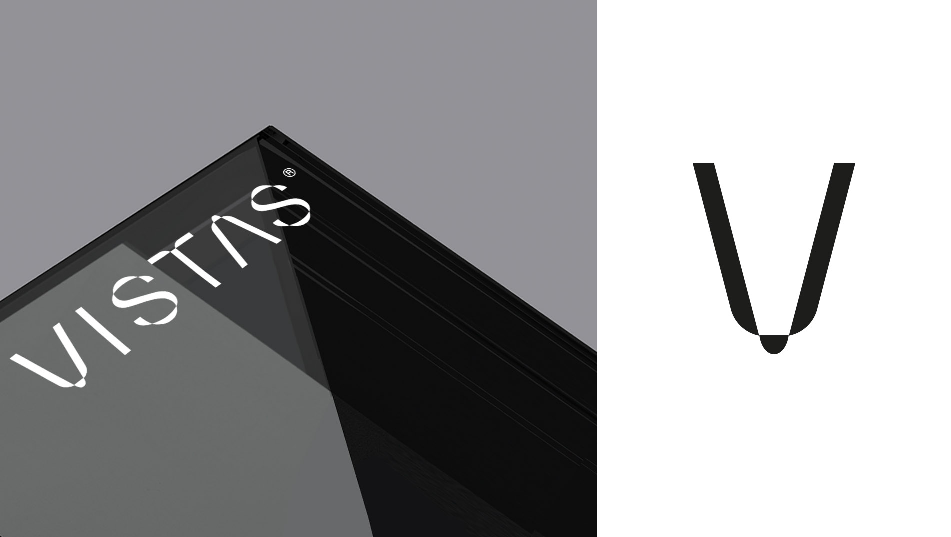
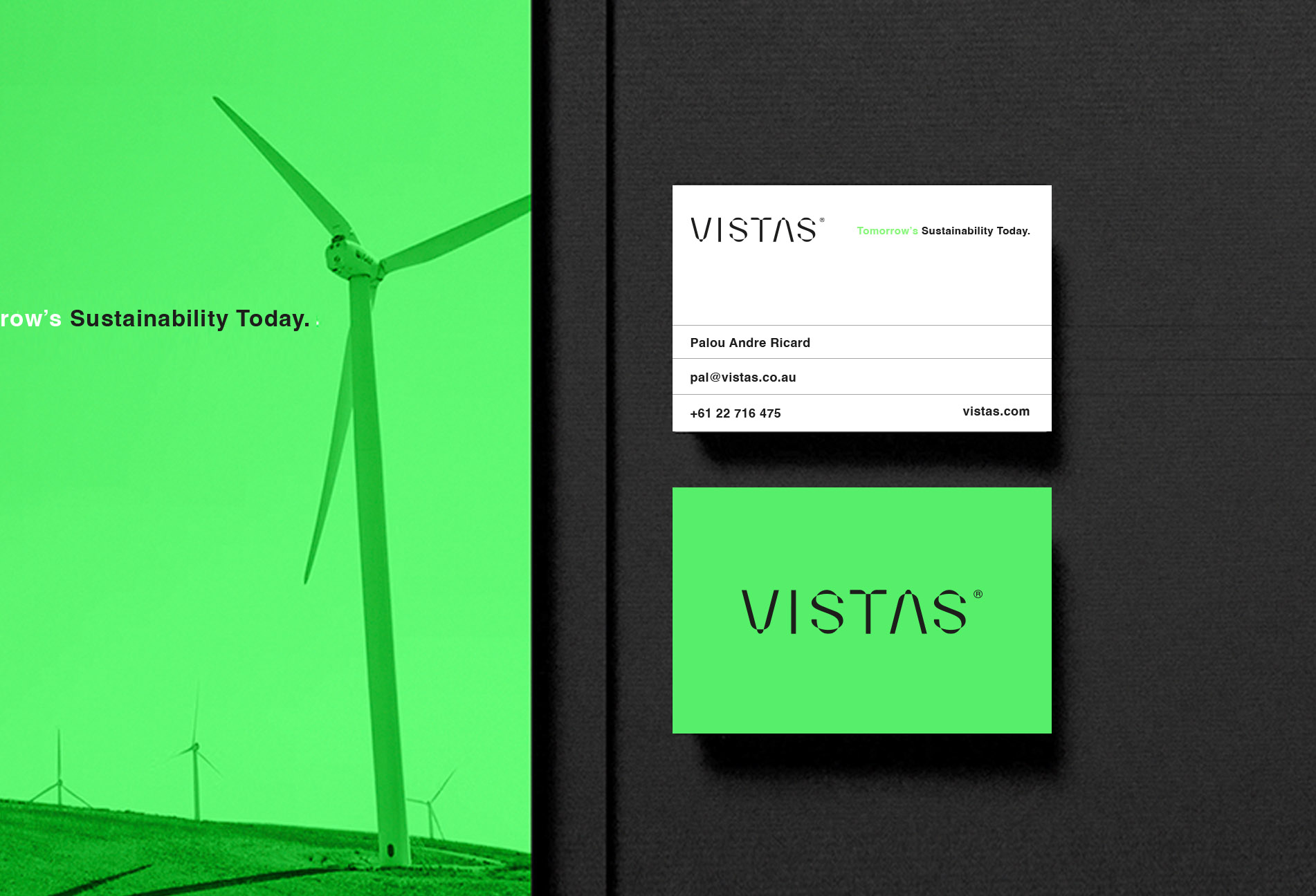
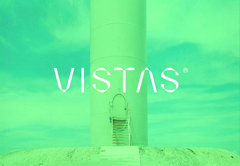
Neoen stands as one of the world’s leading independent producers of renewable energy – a quiet giant spanning continents. From Western Australia’s flagship solar fields, to the radiant expanse of France’s Cestas farm, to the sweeping turbines of Finland’s Mutkalampi, Neoen’s work is a hymn to tomorrow. The world turns to renewable energy for hope – falling costs, cleaner skies, new technologies whispering in the wind. A promise to reduce carbon, to steady the climate, to secure the fragile balance of our shared future. In response to Neoen’s rebrand submission, I created Vistas – a name that captures the poetry of standing high, looking outward, and imagining possibility. Its ‘V’ emblem arcs like a turbine’s blade, an elegant symbol of movement, energy, and vision. The proposed strapline – “Tomorrow’s Sustainability Today” – folds time into itself, a play of words carrying the urgency and beauty of the mission.
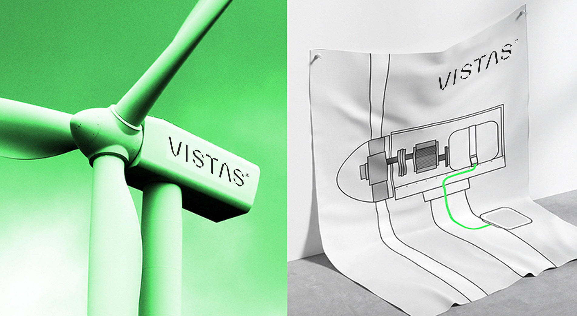
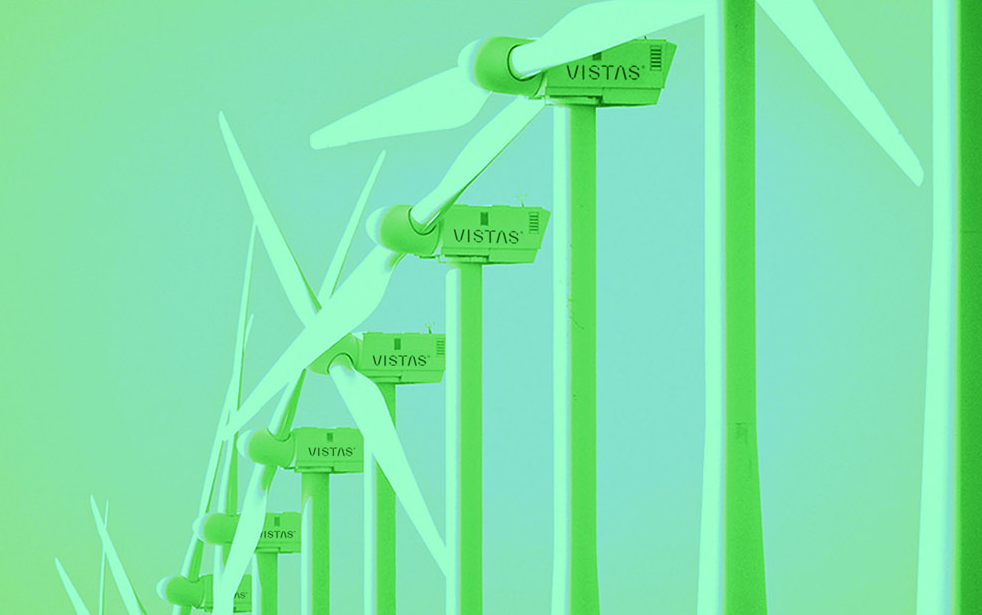
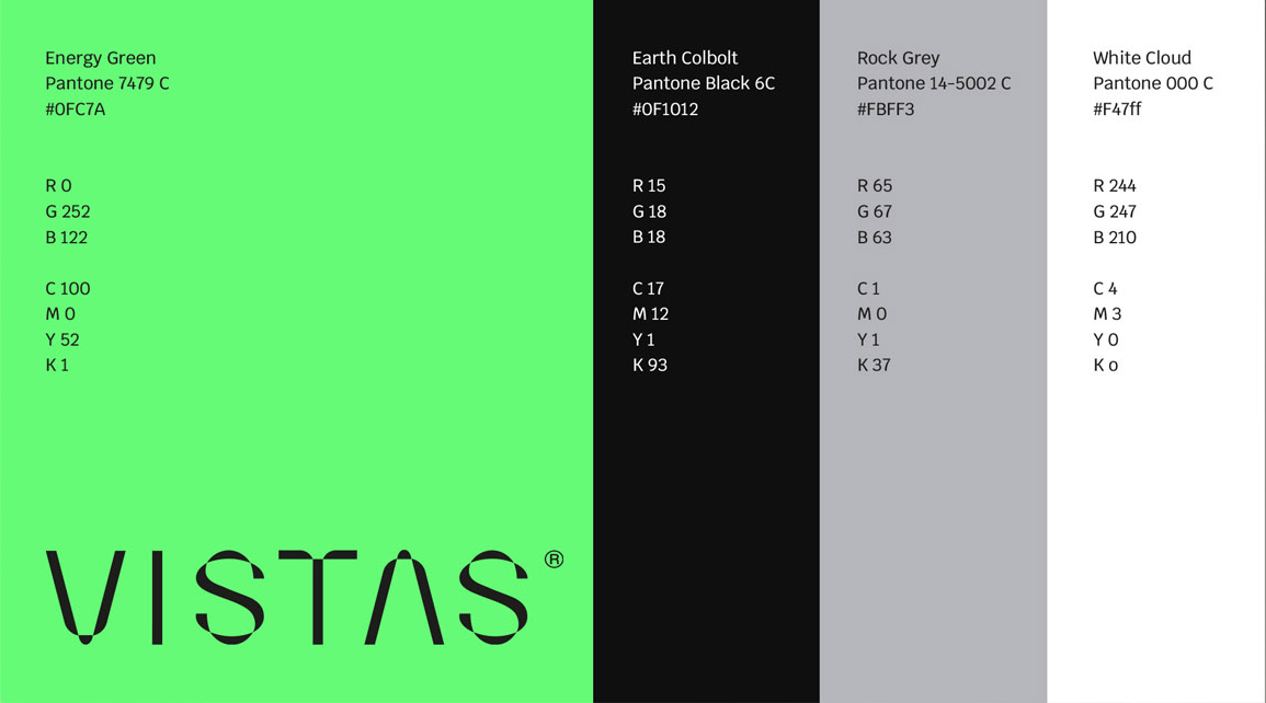
The design unfolded with bold Helvetica, a voice of strength and clarity, resting on a clean palette of electric green, pure white, and deep black – colours of vitality, balance, and resolve. Image direction carried the brand’s spirit further: a child, a paper plane, playing in the wind, a symbol of innocence and inheritance. Turbines rising across vast horizons, their silhouettes graceful against poetic skies. Mother Nature’s landscapes are alive with possibility. Vistas was not just a design; it was a vision. My way of seeing the world – and believing – a brighter future we must create.
Vistas Wind Energy, Neoen, Paris, France
Re-brand Submission